목재 종류
Wood type.jpg)
활판인쇄에서 나무활자는 나무로 만든 가동활자다.중국에서 본문 인쇄에 사용된 나무 활자는 19세기 서양 인쇄에서 포스터 인쇄용 대형 디스플레이 서체를 만드는 데 인기를 끌었는데, 큰 크기의 금속 [1]활자보다 가볍고 저렴했기 때문이다.
목재는 유럽 인쇄 초기부터 목판 장식이나 엠블럼에 사용되었지만, 인쇄를 위해 같은 모양을 여러 번 재현하는 것이 어려워 일반적으로 서체를 만드는 데 사용되지 않았다.1820년대에, 다리우스 웰스는 동력 공유기를 사용하여 산업용 목재 활자 생산을 시작했고, 1834년 윌리엄 레븐워스는 패턴에서 글자의 모양을 자르기 위해 팬터그래프를 사용하는 두 번째 주요 혁신을 추가했다.이것에 의해, 같은 디자인의 목재를 [2][3][4][5][6]반복해 양산할 수 있게 되었습니다.

20세기 석판 인쇄술에서는 사진 조판술과 디지털 조판술이 대중 시장 기술로 대체되었다.그것은 취미생활가들과 예술적 프린터들에 의해 계속 사용되고 있다.
이력


중국과 유럽에서는 목판 인쇄가 가동 [12]활자 인쇄보다 먼저 이루어졌다.
중국에서는 점토활자와 함께 목조활자가 발명되었는데, 그는 점토활자가 더 만족스러웠으며, 왕젠이 [12][13]처음으로 정식으로 인쇄에 사용하였습니다.나무 활자는 손으로 조각하여 매우 큰 한자 [12][14]집합의 활자를 만들었다.중국에서도 [15]점토활자와 금속활자가 사용되었는데, 목재와 점토활자의 문제는 정확한 치수를 만들 수 없다는 것이었고, [14][12]15세기 후반부터 금속활자가 채택되었다.큰 문자 집합의 종류 제작, 선택 및 재배포는 번거로웠고, 중국에서는 많은 인쇄가 가동 [12]활자가 아닌 전체 텍스트 페이지의 커스텀 컷 목판으로 계속 이루어졌다.
유럽에서는 목판인쇄가 유럽의 가동 활자인쇄보다 우선하며, 유럽에서는 활판인쇄와 [16]비슷한 시기에 목판인쇄가 등장했다.그러나 목판본의 큰 단점은 목판본에 의해 한번 만들어지면 주조로 쉽게 복제할 수 없는 반면, 금속 주조를 사용하여 같은 글자의 많은 금속 복사를 빠르게 만들 수 있었고, 유럽 언어의 작은 문자 집합으로 인해 필요한 모든 글자에 대해 활자를 주조하는 것이 실용적이었다는 것이다.유럽 인쇄는 처음부터 주물 [17][a]활자를 사용했다.
유럽의 인쇄된 책들에서, 나무 조각은 장식과 [19]제목처럼 큰 글씨로 사용되었습니다.모래를 주조하여 목판을 조심스럽게 복제할 수 있었다.존 A에 따르면. 레인은 "모래 주조에 의한 목판 복제는 1575년에 기록되었고, 아마도 더 거슬러 올라가며... 장식된 이니셜을 복제한 것은 [20]1615년경 네덜란드에서 흔해졌다."
제임스 모슬리는 "특히 지방 인쇄업자들 사이에서 손으로 자른 큰 글씨로 된 나무 활자의 선사가 있을 것이다. 그러나 기계로 자른 활자가 [21]도입되기 전까지 나무 글자가 널리 사용되었다는 증거는 없다."고 말한다.Mosley와 Justin Howes는 금속활자가 같은 스타일로 출시되기 직전에 목판 글씨가 사용된 사례들을 기록했습니다; 뚱뚱한 얼굴활자가 등장하기 전에 복권 광고에 무거운 로마활자, 그리고 나중에 최초의 알려진 [22][23]인쇄활자보다 몇 년 전에 슬래브 세리프 목판.
19세기 초, 런던은 굵은 글씨체로 된 발전의 중심지가 되었고, 인쇄된 포스터의 도착으로 뚱뚱한 얼굴과 나중에는 슬래브 세리프와 같은 과감한 새로운 형태의 글자에 대한 수요가 증가하였다.그러나, 이 타입들은 처음에는 [23]금속으로 만들어졌다.1810년, 윌리엄 캐슬론 4세는 판금에서 글자를 오려내고 뒷판에 리벳으로 고정함으로써 스텐실처럼 만들어진 "산스파릴" 매트릭스를 도입했는데, 이는 샌드캐스팅보다 훨씬 날카로운 활자를 만들어냈다; 그것은 빠르게 [24]복사되었다.생산된 대형 금속활자는 [25][22]중량을 줄이기 위해 중공으로 주조되었습니다.

장식된 활자는 나무로 자르고, "다빙"이라고 알려진 고정관념의 변형으로 증가했는데, 이 변형에서는 목판이 굳어지기 직전에 녹은 금속에 부딪혀 [26][27][28]주형을 형성했다.현대의 인쇄 역사학자 Giles Bergel과 Paul Nash는 이 기술을 실험했습니다. Bergel은 "아마도 이 공정의 가장 반직관적인 특징은 나무 블록이 녹은 금속과 직접 접촉하여도 살아남을 수 있다는 사실일 것입니다.가장자리가 타는 듯한 느낌과 금이 간 것(아마도 열로 인한 것이 아니라 느슨하게 밀었을 때 생긴 것)을 제외하면 블록은 손상되지 않았고 여러 [29]번 두드려질 수 있었습니다."
목재의 종류 소개

손으로 깎는 것이 아니라 기계로 깎아서 만든 덩어리인 현대 나무 활자는 1828년 [1][31][32][33][34]뉴욕에서 처음으로 알려진 카탈로그를 출판한 다리우스 웰스 (1800–1875)에 의해 발명되었다.그는 나무활자를 손으로 [1][35][36]깎는 것보다 더 빨리 자르기 위해 측면 공유기를 도입했다.
윌리엄 리븐워스는 1834년에 팬터그래프를 도입하여 동일한 형태를 패턴에서 재현할 수 있게 했고,[37][38][39] 뉴저지주 알렌타운에서 목재활자를 제작했습니다.이후 생산된 대부분의 목재 유형은 팬터그래프를 사용하거나 나중에 [1][31]다이커팅을 사용하여 제작되었습니다.
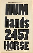
현재 뉴욕 공립 도서관에 있는 Leavenworth의 유일한 생존 표본의 일부 페이지는 아래에 [38]나와 있습니다.
축약된 고딕(산세리프)

고딕(Sans-serif)

"이탈리아어"(역대조, 아래 참조)


_wood_type.jpg)
성숙한 산업
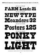
19세기 중반에는 미국에는 수많은 목재 제조 업체가 있었다.주요 제조업체들은 모두 북동부 및 중서부, 뉴욕 주변 또는 코네티컷에 [40]본사를 두고 있었습니다.나무 활자 시장은 분명히 제한적이었고 대부분의 사업체들은 다른 프린터 장비나 다른 [41]목제품을 만드는 딜러로서 부업을 했다.1880년대까지 가장 큰 회사 중 하나는 코네티컷의 노위치 근처에 있는 윌리엄 H. 페이지의 회사였다.우드타입은 디스플레이 [42]타이포그래피 시장에서 리소그래피와 경쟁했다.
.jpg)
![Chromatic color separation Pointed and Tuscan wood type, Wm. H. Page & Co., 1874 specimen[43]](/wiki/File:Pointed_and_Tuscan_wood_type,_Wm._H._Page_%26_Co.,_1874_specimen.jpg)
![Chromatic color separation wood type, Page, 1874 specimen[43]](/wiki/File:Specimens_of_chromatic_wood_type,_borders,_etc._manufactured_by_Wm._H._Page_%26_Co._by_Wm._H._Page_%26_Co._Published_1874.jpg)
일반형 스타일들이 슬래브 세리프, 뚱뚱한 얼굴, sans-serif, reverse-contrast 또는"클래런던 프랑스","토스카나 사람"(편지에 스파이크),"그리스 항아리"( 비스듬한)과 색동 소매 긴 형태 같은 다른 장르를 포함했다.[44](newly-invented형 스타일을 허구적인 형용사 이름의 사용 나무 형식 제조 업체들을 붙였지만 그들에 의해 발명되지 않exa 흔했다.런던에서 mple은 1817년경 그의 첫 번째 슬래브-세리프를 "Antique"라고 불렀고 1821년경 Caslon 주조 공장의 첫 번째 역콘트라스트 서체는 아마도 가칭 "[2][45]Italian"으로 명명되었다.)활자는 초볼드, 초응축 등 극히 비례적으로 제작됐다.베서니 헥은 "미국의 나무 활자는 장식, 너비, 무게의 가장 넓은 범위를 커버하기 위해 좋은 맛과 가독성을 무리하게 만든 미친 과학자들에 의해 개척되었다"[6]고 말했다.

1890년대 동안, J. E. 해밀턴이 소유한 위스콘신주 Two Rivers에 있는 해밀턴 제조 회사는 빠르게 성장했고 대부분의 [1][46]경쟁업체들을 인수했다.그것은 [40]1985년까지 나무 활자를 계속 만들었다.이 회사의 살아남은 자료들은 현재 투리버스에 [1][47][48]있는 해밀턴 우드 활자 인쇄 박물관에 보존되어 있다.
목재활자는 금속활자에 비해 독특한 특징이 있었다.금속보다 나무를 자르기 쉽고, 각각의 활자를 무늬에서 개별적으로 자르기 때문에, 새로운 스타일과 새로운 크기의 활자를 도입하는 것은 꽤 쉬웠다.타입은 폭넓은 폭에서 판매되었고, 해밀턴은 표준 [49]폭 사이에서 원하는 폭의 모든 폭을 정가에 공급하겠다고 제안했습니다.또, 인쇄 [50]색분리를 위해서 「크로매틱」활자를 제작했습니다.
.jpg)
목재활자 제조는 특히 미국에서 보편화되어 수출용으로 다른 언어로 활자를 제작했다.1870년대까지 중국에서 활동하던 선교사들이 포스터 인쇄를 의뢰했고 러시아인과 버마인을 위한 목재활자 또한 [51]수출용으로 만들어졌다.이 밖에도 미국 제조업자들은 대규모 이민자 [51][52]커뮤니티에 맞는 독일식 블랙레터, 그리스어, 히브리어를 만들었다.프랑스, 독일,[5][53] 영국, 그리고 다른 [54]나라에도 나무활자 제조업체가 있었다.

블랙레터 타입, 해밀턴

슬래브 세리프, 해밀턴

응축 산세리프, 해밀턴
커빙 단자가 있는 슬래브 세리프, 해밀턴

프렌치 클래런던(역대조), 해밀턴
.jpg)
.jpg)
.jpg)
.jpg)
.jpg)

비록 데일리 익스프레스지 사용자 지정 디자인 Kabel은 Bold초집적에 유사 윈체스터 Bold와 더 타임즈는 사용했다 S.L.Righyni 영국의 늦은inter-war 기간에 따르면 newsbills newsagents이 올린에 있는 표준 letterform, 특히 스티븐슨은 블레이크에서 농축 sans-serifs 대담하고"그sans-serif 나무 letter-form"다.[55](Althouh 나무 활자는 뉴스 청구서와 포스터에 사용되었고, 큰 신문 헤드라인은 20세기까지 영국 신문 인쇄에서 드물었다.)[56]
목질 제조사
미국
영국
독일.
- 윌 & 슈마허, 이후 삭스 & Co.[5]
프랑스.
레거시 테크놀로지


출판 업계의 오프셋 판화와 사진 식자의 인수로 목 활자의 아메리카나 시대들은 그것들의 공명과 복사. Photo-Lettering과 하버 Typographers 같은 사진 식자 업체들에 의해 갔고 1960년대에 밥 카토와 존 Berg,[62]고 나중에 폴라 셔 차관보와 루이스 Fi과 같은 디자이너들에 의해 사용되는 제공되었다.li.[63][64]잭 Stauffacher처럼 예술적인 프린터 나무 형식을 사용하여에 있는 저렴한 방법 창의적인 효과를 얻어내는 것을 실시했다.목 활자 역사가 로브 로이 켈리, 목 활자 제조 업체들의 미적 질( 들어[65]는 20세기에, 닉은 셔먼과 Frode Helland 퓨우 트라 체의 Hamil에서 믿기 어려울 정도로 나쁜 연주에 대해 이야기 해왔다 거절했다.일관되지 않은 스트로크 무게, 서로 다른 높이의 i와 j의 점, 그리고 거꾸로 인쇄된 표본의 8을 특징으로 하는 톤의 1951년 표본).[66][67][68]
1950년대에 미국의 그래픽 디자인 교사인 롭 로이 켈리는 나무 활자의 역사에 관심을 갖게 되었고 오래된 인쇄소와 인쇄소 [61][69]같은 자료로부터 많은 컬렉션을 모았다.그는 1969년에 [70][71][72]산업 역사, American Wood Type, 1828~1900을 출판했습니다.현재 [73]오스틴에 있는 텍사스 대학에 있는 그의 컬렉션은 데이비드 [40][74][75][76]쉴즈와 같은 다른 목재 유형의 역사학자들에 의해 연구되어 왔다.
메모들
- ^ 최초의 인쇄 방법에 대한 증거는 거의 남아 있지 않지만, 탤벗 베인스 리드, 알프레드 F.와 같은 역사학자들의 의견은 남아 있다. Johnson, Harry Carter 및 James Mosley는 최초의 인쇄 방법이 펀치, 매트릭스 및 [17]몰드를 사용하여 19세기 기계화되기 전까지 금속활자에 사용된 방법과 매우 유사했다고 합니다.Paul Needham과 같은 역사학자들은 종종 초기 인쇄에서 고정관념을 회반죽으로 주조하는 것과 같은 다른 방법들이 사용되었다고 제안했는데, 그 자체는 대안적인 설명을 제안했던 제임스 모슬리에 의해 논쟁되어 왔다; 어떤 경우든, 어떤 대안적인 방법들이 오래 지속되지 않았고, 유럽 프린트에서 그것은 확실하다.금속활자 인쇄가 [18]일반적이었습니다.
레퍼런스
인용문
- ^ a b c d e f Shields, David. "What Is Wood Type?". Hamilton Wood Type and Printing Museum. Archived from the original on 20 November 2021. Retrieved 20 November 2021.
- ^ a b Shields, David (2008). "A Short History of the Italian". Ultrabold: The Journal of St Bride Library (4): 22–27. Archived from the original on 19 November 2021. Retrieved 23 December 2021.
- ^ Dennis Ichiyama. "2004 Friends of St Bride conference proceedings: How wood type tamed the west". Stbride.org. Archived from the original on 11 November 2013. Retrieved 11 November 2013.
- ^ "Old West Reward Posters". Wildwestweb.net. Archived from the original on 11 November 2013. Retrieved 11 November 2013.
- ^ a b c Pané-Farré, Pierre (8 March 2021). "The case of Will & Schumacher". Klim Type Foundry. Archived from the original on 24 December 2021. Retrieved 23 December 2021.
- ^ a b Heck, Bethany. "Champion Gothic". Font Review Journal. Archived from the original on 16 August 2019. Retrieved 13 September 2019.
- ^ Pires, Candice (2 April 2016). "A-Z living: an inside look at typographer Alan Kitching's home". The Guardian. Archived from the original on 16 June 2016. Retrieved 16 June 2016.
- ^ ""I always try to have some logic to the job, to the work": we interview letterpress legend Alan Kitching". It's Nice That. 31 March 2016. Archived from the original on 25 June 2016. Retrieved 16 June 2016.
- ^ "Alan Kitching on Press at The Guardian Newspaper Club". blog.newspaperclub.com. Archived from the original on 1 July 2016. Retrieved 16 June 2016.
- ^ Waters, John L.; Kitching, Alan (2016). A life in letterpress. Lawrence King. ISBN 978-1780674810.
- ^ Sinclair, Mark (22 April 2016). "Alan Kitching a life in Letterpress". Creative Review. Creative Review. Archived from the original on 1 July 2016. Retrieved 16 June 2016.
- ^ a b c d e Taylor, Insup; Taylor, Martin M. (1 January 1995). Writing and Literacy in Chinese, Korean and Japanese. John Benjamins Publishing. pp. 156–157. ISBN 978-90-272-1794-3. Archived from the original on 15 August 2022. Retrieved 1 August 2022.
- ^ Lu, Yongxiang (10 October 2014). A History of Chinese Science and Technology: Volume 2. Springer. pp. 214–220. ISBN 978-3-662-44166-4. Archived from the original on 15 August 2022. Retrieved 1 August 2022.
- ^ a b Deng, Yinke (3 March 2011). Ancient Chinese Inventions. Cambridge University Press. pp. 23–26. ISBN 978-0-521-18692-6. Archived from the original on 15 August 2022. Retrieved 1 August 2022.
- ^ Wilkinson, Endymion Porter (2000). Chinese History: A Manual. Harvard Univ Asia Center. pp. 449–453. ISBN 978-0-674-00249-4. Archived from the original on 15 August 2022. Retrieved 6 August 2022.
- ^ Cowley, Des; Williamson, Claire (2007). The World of the Book. pp. 19–22. ISBN 9780522853780.
- ^ a b Carter, Harry (2008). A View of Early Typography Up to About 1600. Hyphen Press. pp. 6–12. ISBN 9780907259213.
- ^ Mosley, James. "Fallen and threaded types". Type Foundry. Archived from the original on 3 July 2022. Retrieved 3 July 2022.
- ^ Vervliet, Hendrik D. L. (2008). The palaeotypography of the French Renaissance : selected papers on sixteenth-century typefaces. Leiden: Brill. p. 240. ISBN 9789004169821.
- ^ Lane, John A. (27 June 2013). "The Printing Office of Gerrit Harmansz van Riemsdijck, Israël Abrahamsz de Paull, Abraham Olofsz, Andries Pietersz, Jan Claesz Groenewoudt & Elizabeth Abrahams Wiaer c.1660–1709". Quaerendo. 43 (4): 311–439. doi:10.1163/15700690-12341283.
- ^ 모슬리 2003, 페이지 113
- ^ a b Mosley, James. "The Nymph and the Grot: an Update". Typefoundry blog. Archived from the original on 19 October 2015. Retrieved 12 December 2015.
- ^ a b 모슬리 1993, 페이지 10
- ^ 모슬리 2003, 페이지 103
- ^ 모슬리 2003, 페이지 112
- ^ Mosley, James. "Big brass matrices: a mystery resolved?". Type Foundry (blog). Archived from the original on 6 October 2017. Retrieved 5 October 2017.
- ^ Mosley, James. "Big brass matrices again: the Enschedé 'Chalcographia' type". Type Foundry (blog). Archived from the original on 6 October 2017. Retrieved 5 October 2017.
- ^ Mosley, James. "Dabbing, abklatschen, clichage..." Type Foundry (blog). Archived from the original on 14 November 2017. Retrieved 5 October 2017.
- ^ Bergel, Giles. "Printing cliches". Printing Machine. Archived from the original on 6 August 2019. Retrieved 25 July 2021.
- ^ Moore, Scott. "Cutting New Wood Type With a Historic Pantograph". YouTube. Ann Arbor District Library. Archived from the original on 27 June 2022. Retrieved 27 June 2022.
- ^ a b c 켈리 1969, 페이지 36-37
- ^ Trumbell, Levi R. (1882). A History of Industrial Paterson: Being a Compendium of the Establishment, Growth and Present Status in Paterson, N.J., of the Silk, Cotton, Flax, Locomotive, Iron and Miscellaneous Industries : Together with Outlines of State, County and Local History, Corporate Records, Biographical Sketches, Incidents of Manufacture, Interesting Facts and Valuable Statistics. Higginson Book Company. ISBN 978-0-8328-6070-6. Archived from the original on 15 August 2022. Retrieved 23 December 2021.
- ^ The Great Industries of the United States: Being an Historical Summary of the Origin, Growth and Perfection of the Chief Industrial Arts of this Country: by Horace Greeley ... and Other Eminent Writers, Etc. Hartford: J. B. Burr & Hyde. 1872. pp. 1265–1271. Archived from the original on 15 August 2022. Retrieved 23 December 2021.
- ^ 켈리 1969, 페이지 33-34
- ^ Clayton, W. Woodford; Nelson, William, eds. (1882). History of Bergen and Passaic Counties, New Jersey: With Biographical Sketches of Many of Its Pioneers and Prominent Men. Everts & Peck. p. 489. Archived from the original on 15 August 2022. Retrieved 21 January 2022.
- ^ Griffin, Dori (30 December 2021). Type Specimens: A Visual History of Typesetting and Printing. Bloomsbury Publishing. p. 117. ISBN 978-1-350-11662-7. Archived from the original on 15 August 2022. Retrieved 2 August 2022.
- ^ Johnson's Universal Cyclopaedia: A Scientific and Popular Treasury of Useful Knowledge. A. J. Johnson. 1886. Archived from the original on 2 August 2022. Retrieved 2 August 2022.
- ^ a b c Specimen of Leavenworth's patent wood type, manufactured by J. M. Debow. Allentown. Archived from the original on 13 July 2022. Retrieved 13 July 2022.
- ^ Leavenworth, Elias W. (1873). A Genealogy of the Leavenworth Family in the United States: With Historical Introduction, Etc. S. G. Hitchcock & Company. pp. 239–240. Archived from the original on 15 August 2022. Retrieved 2 August 2022.
- ^ a b c 보호막 2022
- ^ 켈리 1969, 페이지 61~62
- ^ MacMillan, David. "Why No "Type Designers" Here?". Circuitous Root. Archived from the original on 24 September 2021. Retrieved 2 July 2022.
- ^ a b Specimens of chromatic wood type, borders, etc. manufactured by Wm. H. Page & Co. Greeneville, Connecticut: Wm. H. Page & Co. 1874. Retrieved 15 August 2022.
- ^ Lupton, Ellen (15 April 2014). Thinking with Type. p. 23. ISBN 9781616890452.
lthough Bodoni and Didot fuelled their designs with the calligraphic practices of their time, they created new forms that collided with typographic tradition and unleashed a strange new world, where the structural attributes of the letter-serif and stem, thick and thin strokes, vertical and horizontal stress-would be subject to bizarre experiments...Fonts of astonishing height, width and depth appeared: expanded, contracted, shadowed, inlined, fattened, faceted and floriated. Serifs abandoned their role as finishing details to become independent architectural structures, and the vertical stress of traditional letters canted in new directions.
- ^ Frere-Jones, Tobias. "Scrambled Eggs & Serifs". Frere-Jones Type. Archived from the original on 28 September 2015. Retrieved 23 October 2015.
- ^ Shields, David. ""The Wood Type business should go West…" An 1887 letter from William H. Page to W.B. Baker". Wood Type Research. Archived from the original on 30 June 2022. Retrieved 30 June 2022.
- ^ "Creative Destinations: Two Rivers, Where Wood Type Still Makes a Big Impression". Fastcodesign.com. 12 November 2010. Archived from the original on 4 March 2012. Retrieved 10 February 2012.
- ^ Cheng, Jacqui. "Wood Stock". The Magazine. Archived from the original on 15 August 2022. Retrieved 27 June 2022.
- ^ Shields, David. "Unit Gothic & Uniform Set Gothic: wood type as precursor". Wood Type Research. Archived from the original on 30 June 2022. Retrieved 30 June 2022.
- ^ Shields, David. "Chromatic Gothic Paneled". Wood Type Research. Archived from the original on 30 June 2022. Retrieved 30 June 2022.
- ^ a b 켈리 1969, 76페이지
- ^ Specimens of Wood Type [blackletter types]. Greeneville: Wm. H. Page (digitisation: St Louis Public Library). 1859. Retrieved 15 August 2022.
- ^ Pané-Farré, Pierre. "Panorama : A reassesment of 19th century poster type". École supérieure d’art et de design d’Amiens. Archived from the original on 15 August 2022. Retrieved 15 August 2022.
- ^ 켈리 1969, 34페이지
- ^ Righyni, S. L. (1946). "News Bills: A Retrospectus". Alphabet & Image (2): 34–49.
- ^ Reilly, Lucas. "Quartz Weekly Obsession: Victorian Newspapers". Quartz. Archived from the original on 3 July 2022. Retrieved 3 July 2022.
- ^ 켈리 1969, 37페이지
- ^ 켈리 1969, 페이지 43~44
- ^ 켈리 1969, 페이지 47-49
- ^ Bolton, Claire (1988). DeLittle, 1888–1988 : the first years in a century of wood letter manufacture, 1888–1895. Alembic Press. ISBN 9780907482291.
Wood type was first made in the United States in 1828 and by the mid-1840s was being used in Britain...the first British firms began cutting wood type during the 1860s. DeLittle entered the field comparatively late but his idea was to specialise [in] 'white-letter' wood type.
- ^ a b 켈리 1969, 7페이지
- ^ Coles, Stephen (21 December 2015). "Bob Dylan – The Times They Are A-changin' album art". Fonts In Use. Archived from the original on 21 September 2021. Retrieved 28 June 2022.
Haber...provided phototype versions of Morgan wood type, including Nesbitt’s Gothic, for much of the New York design scene
- ^ Hoefler, Jonathan. "Jonathan Hoefler 2017 Wayzgoose Presentation at Hamilton Wood Type & Printing Museum". YouTube. Hamilton Wood Type and Printing Museum. Archived from the original on 27 June 2022. Retrieved 27 June 2022.
- ^ Scher, Paula (2020). Twenty-Five Years at the Public. Princeton Architectural Press. pp. 39–42. ISBN 9781616899349.
When I left CBS Records, I had asked Haber Typographers for large-scale prints of the complete alphabets, numbers and punctuation for all of the wood fonts from the foundry. All through the '80s, I repeatedly xeroxed the fonts and used them on book covers and in magazines.
- ^ 켈리 1969, 페이지 7-8
- ^ Helland, Frode. "The best Futura". Twitter. Monokrom Schriftvorlag. Archived from the original on 15 August 2022. Retrieved 7 August 2022.
- ^ Sherman, Nick (2012). "The Design of Type Specimens". The Shelf. Archived from the original on 8 August 2022. Retrieved 8 August 2022.
A seemingly random mishmash of characters were used to present an already-wonky cut of Futura in Hamilton Manufacturing Company's wood type catalog #25, 1951.
- ^ Devroye, Luc. "Hamilton Holly Wood Type Co. (or: Hamilton Manufacturing Company) [James Hamilton]". Type Design Information Page. Archived from the original on 15 April 2021. Retrieved 7 August 2022.
- ^ "Rob Roy Kelly Obsessions: Wood Type Research". www.rit.edu. Archived from the original on 4 March 2022. Retrieved 4 March 2022.
- ^ Kelly 1969.
- ^ Hoefler, Jonathan. "A Treasury of Wood Type Online". Hoefler & Co. Archived from the original on 4 October 2019. Retrieved 27 June 2022.
- ^ Hoefler, Jonathan. ""Curved, Pointy, and Nervous-Looking Types"". Hoefler & Co. Archived from the original on 19 November 2021. Retrieved 27 June 2022.
- ^ "The Rob Roy Kelly American Wood Type Collection". School of Design and Creative Technologies, Department of Art and Art History, University of Texas at Austin. Archived from the original on 18 April 2022. Retrieved 27 June 2022.
- ^ Shields, David (4 December 2018). "Rob Roy Kelly: A bottle of Scotch for two cases of wood type with David Shields". Vimeo. Cooper Union. Archived from the original on 30 June 2022. Retrieved 30 June 2022.
- ^ Shields, David. "Muster Hundreds! Towards a people's history of American wood type". YouTube. ATypI. Archived from the original on 30 June 2022. Retrieved 30 June 2022.
- ^ Shields, David (18 October 2017). "The proliferation of 19th (and 20th) century wood type and its impact on typographic norms, with David Shields". Vimeo. Cooper Union. Archived from the original on 30 June 2022. Retrieved 30 June 2022.
참고 문헌
- Gray, Nicolete (1977). Nineteenth Century Ornamented Typefaces.
- Kelly, Rob Roy (1963). "American Wood Type". Design Quarterly (56): 1–40. doi:10.2307/4047285. JSTOR 4047285.
- Kelly, Rob Roy (1969). American Wood Type, 1828–1900.
- Lewis, John (1962). Printed Ephemera: the changing uses of type and letterforms in English and American printing. Ipswich: W. S. Cowell.
- Mosley, James, ed. (1990). A Specimen of Printing Types & Various Ornaments 1796: Reproduced Together with the Sale Catalogue of the British Letter-Foundry 1797. Printing Historical Society. pp. 5–12. ISBN 9780900003103.
Big types had been cast in sand, using wooden patterns, for some centuries [by 1750] but there is evidence that English typefounders only began to make big letters for posters and other commercial printing towards 1770, when Thomas Cottrell made his 'Proscription or Posting letter of great bulk and dimension' and William Caslon II cast his 'Patagonian' or 'Proscription letters'.
- Mosley, James (1993). Ornamented types: twenty-three alphabets from the foundry of Louis John Poucheé. I.M. Imprimit in association with the St. Bride Printing Library.
- Mosley, James (2001). "Memories of an Apprentice Typefounder". Matrix. 21: 1–13.
- Mosley, James (2003). "Sanspareil Matrices". Matrix. 23: 104–114.
- Shaw, Paul (April 2017). Revival Type: Digital Typefaces Inspired by the Past. Yale University Press. pp. 132–155. ISBN 978-0-300-21929-6. Archived from the original on 23 December 2021. Retrieved 23 December 2021.
- Shields, David (2022). The Rob Roy Kelly American Wood Type Collection: A History and Catalog. University of Texas Press. ISBN 978-1-4773-2368-7.